
Hello, readers! Do you sometimes envision a kitchen able to darn near make you feel as though a very light spring breeze on a sunny day had passed through it? Or maybe one in which every meal seemed somehow more special or important just because you surrounded it with beauty? Today, we share with you the world of illumination through pastel-colored kitchens—soft hues, gentle tones morphing your cooking space into serene yet stylish sanctity.
Today we will look at the following:
→ Why use pastel colors in your kitchen
→ The best shades of pastel for different kitchen elements
→ How to include pastels without overwhelming a space
→ Inspiring design ideas to get you underway
→ Finishing touches to complete the look

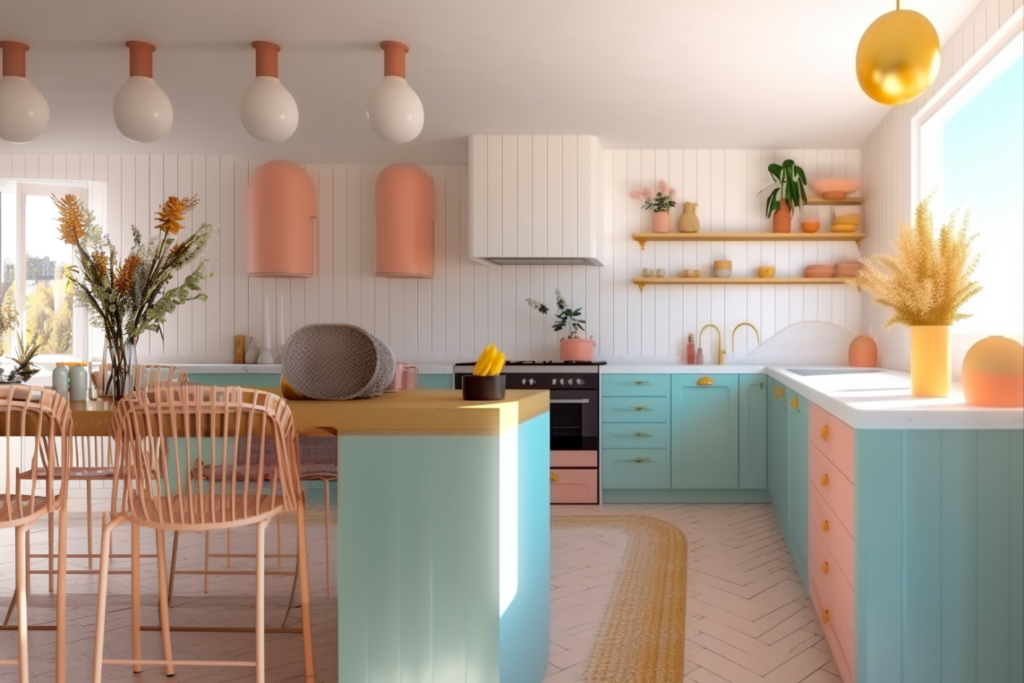
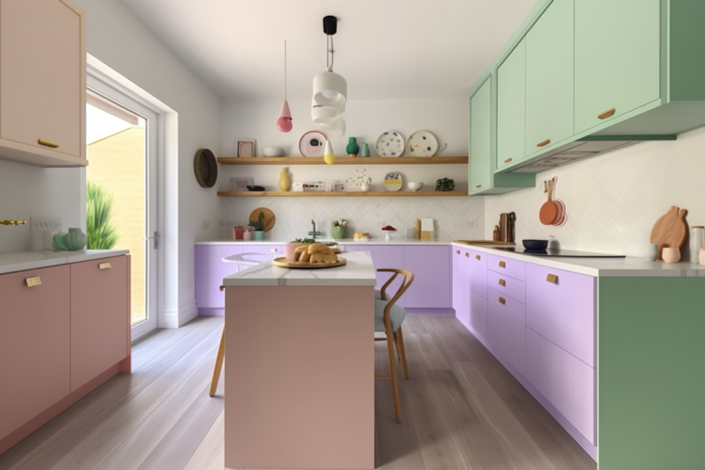
Why Choose Pastel Colors for Your Kitchen?
The unsung heroes of interior design have got to be pastel colors—elegance and tranquility subtler than any other color family in any room, if not more, is in the kitchen. Unlike loud and arresting colors, pastels offer gentle touches, thus making your kitchen seem larger and much more open—just perfect for cooking up some extra special dinner or enjoying a mid-morning cup of coffee.
These soft, delicate hues are best represented by soft pinks, baby blues, mint greens, and delicate lavenders. Each can serve a special purpose in rejuvenating the kitchen area:
Cabinets: Light mint or baby blue cabinets bring freshness to the look of your kitchen. These colors look perfect for creating a clean, crisp look yet still feel warm and inviting.
Walls: Soft pink and pastel lavender will provide cozy elegance to the kitchen walls. These hues will work well with white or natural wood accents.
Accents and Accessories: Think of utensils, appliances, and dishware in pastel shades. A pale yellow toaster or blush mixer will add color without overwhelming the space.
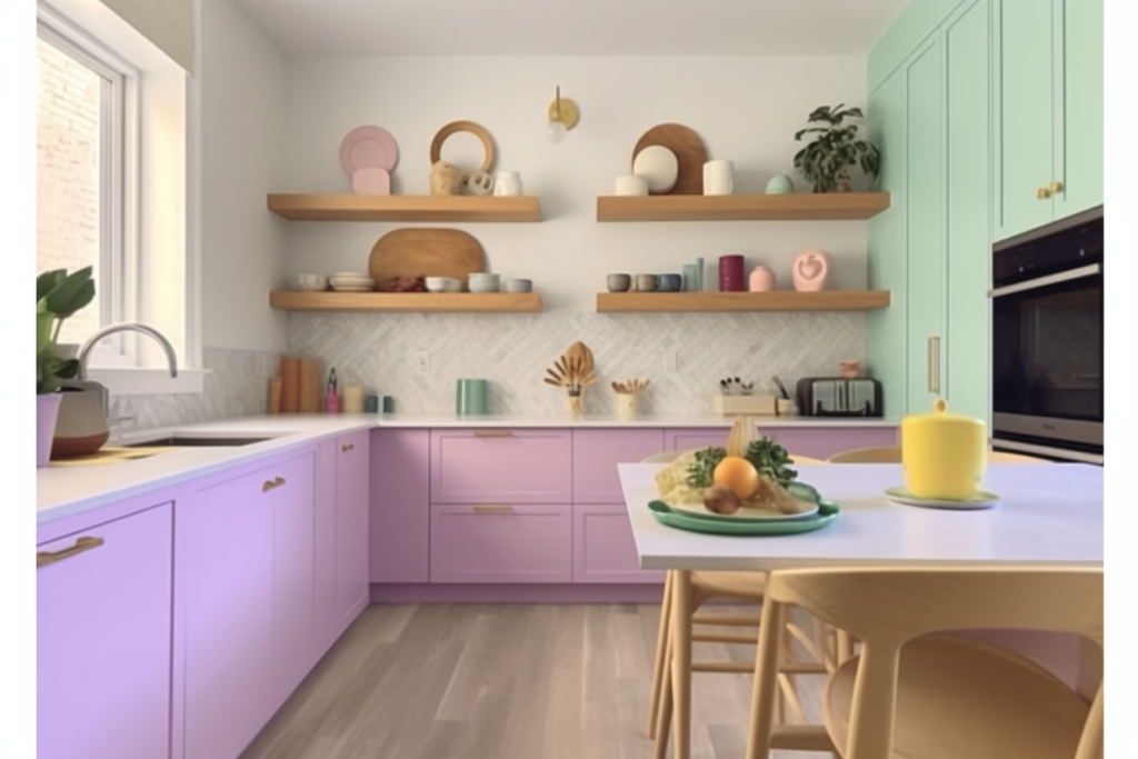
Tips on Adding Pastels Without Overwhelming the Space
Balance is what you do with pastels. Give mismatched looks so that it can look stylish and harmonious inside a kitchen. WHERE TO BEGIN If you’re new to using pastels, start small—think dish towels, rugs, or backsplash tiles. This lets you get a feel for the color in your space without committing too much.
Mix with Neutrals: Coupled with pastel colors, the effect can be suitable, in combination with neutral colors like white, beige, and light gray. This will create a far more balanced look that prevents pastels from getting overwhelming.
Natural Light: Allow natural light to work on its own and make your soft tones of the Pastel kitchen glow. Large windows or well-placed light inclusions are capable of making your pastel hues shine.
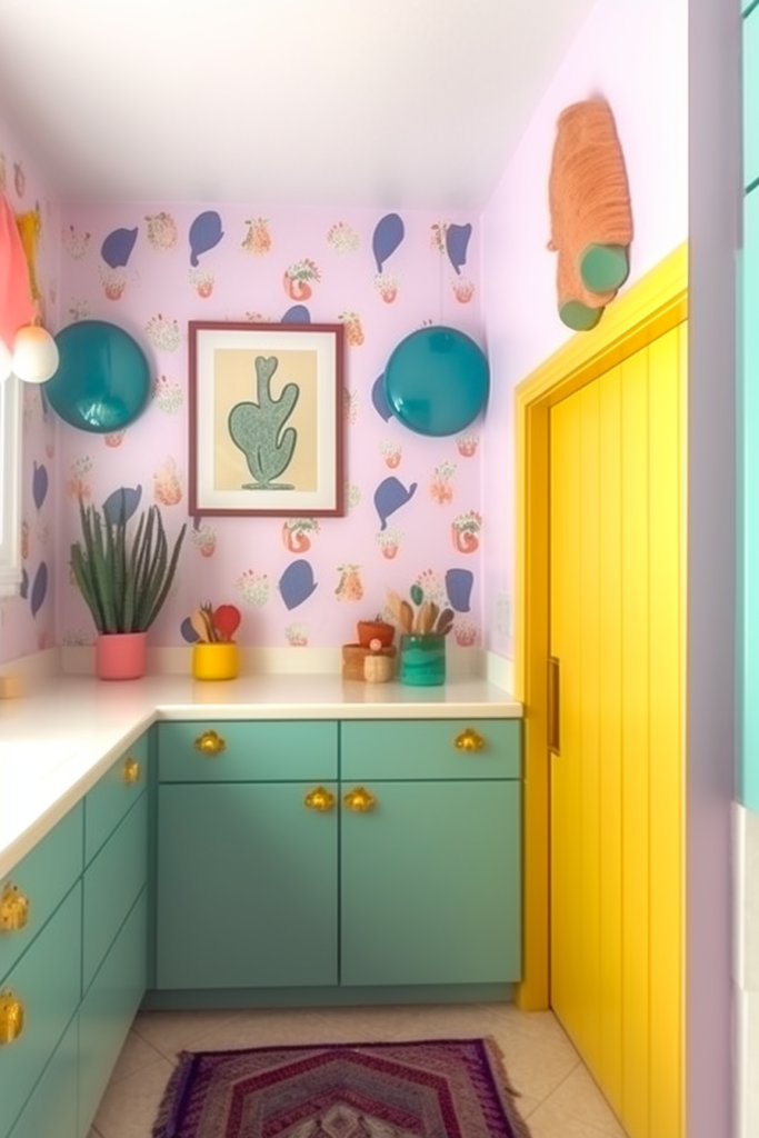
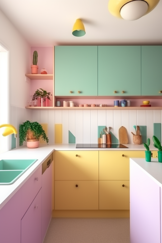
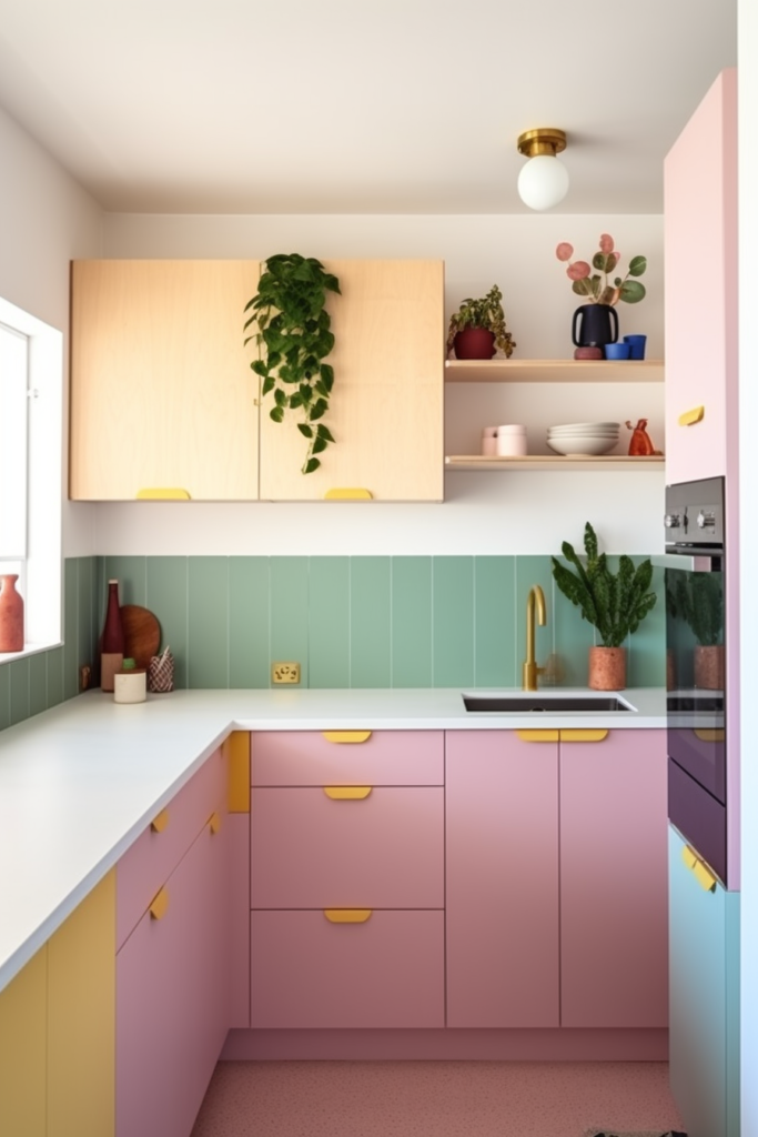
Ideas to inspire your design
Here are some design ideas to get you started:
Scandinavian Pastel: Pastel-toned cabinets are paired with minimalist design and natural wood finishes to convey a chic Scandinavian look.
CharmVintage: Pastel colors would be perfect for creating a vintage-inspired kitchen with retro appliances, checkered floors, and delicate floral patterns brea.
Modern Elegance: This is a bit more modern take—pastel tones mixed with sleek, contemporary fixtures and accents of stainless steel. It creates an atmosphere that is at once sophisticated and playful.
Final Touches to Finish Off Your Look
To really make your pastel kitchen work, consider adding these final touches:
Art and Accessories: Hang pastel-themed artwork or place around your kitchen vases in pastel colors filled with fresh flowers.
Textiles: Choose pastel-colored curtains, chair cushions, and tablecloths that pull the whole look together.
Bring in nature with indoor plants to accentuate your space. This will create a nice contrast against the soft pastel hues.
With these ideas and tips, you’re truly well on your way to creating your own pastel haven in the kitchen. So here’s to sweet decorating and culinary adventures that will become as palatable as your newly turned space!


